Many Visitors But No Sales? Read this
Customer Experience - December 29, 2023 - 5 min
QUICK LINKS
We all want customers to checkout quickly and drive more sales. But the harsh reality is up to 69% abandon their carts during checkout.
There are many reasons for these abandonments – changing intent, price concerns, delivery uncertainty. One key area we can directly improve is simplifying the checkout experience itself.
The checkout flow is the make-or-break conversion gate. Confusion and friction there directly cause many customers to give up, even when they are ready to buy.
So it’s time to examine your checkout page. What might confuse customers or cause hesitation? What obstacles can we remove?
Let’s dive into the 6 best practices to help you to guide customers through a smooth, easy ride to “Thank you for your order!”
(A big thanks to the Baymard Institute for their invaluable research on UX, which provided the data and insights behind many of these best practices).
Guest Checkout
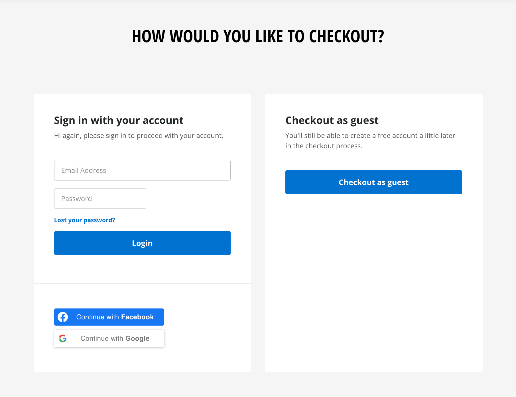
Many customers just want to check out quickly. Make guest checkout the prominent option, bold and beautiful, so customers can check out quickly with just a few clicks rather than navigating extra login steps.
- Allow guest to checkout without requiring account creation first
- Position the guest option clearly and make it visually distinct
- Don’t hide it behind small text links that are easy to miss
Keep Account Signup Simple
If customers do opt to create an account at checkout, don’t make it more complicated than it needs to be.
- Avoid overly complex password rules
- Length requirements beyond 8 characters see steep drop-offs
- Instead, offer tips to improve security
Delivery Dates, Not Delivery Speed
Customers want to checkout quickly when their purchase interest is at its peak. But even a small bit of uncertainty around when they’ll actually receive their order can plant enough doubt to lose the sale.
Generic shipping speeds like “2-4 working days” just don’t provide enough clarity when someone’s ready to purchase. Will it get there in 2 days? Or 4 days? When those 2 days start – from purchase or shipment?
If a customer is unsure for even 1 second about their order, the likelihood of them abandoning increases.
Instead, clearly display the actual expected delivery date range after purchase. Transparency builds trust, and trust fuels conversions.
Include In-store Pickup Options
Not everyone wants to wait for delivery. By presenting pickup prominently within the shipping selector, you make it easy for them to choose the method that best fits their needs.
Moreover, offering more choices shows you understand your customers and care about their preferences. This goes a long way in building trust and loyalty.
Assist Accurate Credit Card Input
Trying to carefully type out a long card number, expiration date, and security code with no validation is painful. It often leads to typos, errors, and frustration for the user.
You can assist customers in avoiding mistakes by:
- Matching the field sequence on your checkout to the physical card layout. By mirroring that layout on your checkout fields, you tap into this natural flow, guiding users effortlessly. It’s the little detail that make a big difference, turning a potentially confusing process into a seamless, intuitive experience.
- Validating card number as typed
- Following standard date formatting
Order Review & Edit: Don’t Make Them Start Over
Despite best efforts, some customers inevitably spot mistakes right at the end when reviewing their whole order. But editing those errors often means starting checkout over.
Don’t lose those customers now after they made it so far!
- Allow changes directly on the review page
- Clear calls-to-action to edit details
- Prevents loss of progress when fixing mistakes
There are a dozen other critical considerations during checkout from using clear terminology, indicating required fields, and limiting distractions. But focusing on these most common areas will solve the majority of abandonment issues.
Bonus: Live Support for Effortless Edits (and More!)
Don’t just offer editing, offer a helping hand!
Integrate a seamless live chat widget directly into your store. This way, customers can chat with your friendly support team in real-time, getting help with payment errors, resolving confusing confirmation issues, or verifying unexpected totals.
You can guide customers smoothly from browsing to order confirmation:
- Full order visibility: See customers’ orders and shopping carts directly within the chat window for faster resolution.
- Effortless edits: Chat, and help customers create or edit orders within one view.
- Increased loyalty: Live support builds trust and reduces checkout anxiety.
- Personalized assistance: Get tailor-made help for any issues or recommend the items your customer loves.
- Streamlined communication: Manage all customer interactions in one inbox.
If you’re looking for a live chat software, here are some popular options: Chative.IO, Tidio, Intercom, Live Chat, etc. Check them out!
By leveraging these tips, we can all work together to create smoother, more enjoyable checkouts for our customers. Super excited to hear what you think! Let’s chat and inspire each other ?
Related Posts
November 09, 2024
Customer Journey: Optimize for Conversions & Loyalty
May 14, 2024
Don’t Just Focus On Revenue and Orders
December 29, 2023
Many Visitors But No Sales? Read this
December 22, 2023
Top 5 Tips for an Exceptional E-commerce Product Page
July 26, 2023


